Thursday 20 October 2011

Sending Off For Copyright.

We sent a letter to the record lable that released RadioHeads song climbing up the walls in order to ask their permition to use their song in our video. And to confirm that we can go ahead with our video.


To Parlophone Records

We are a group of A Level students working on an A Level project for a qualification in Media Studies. We are writing to request permission to use the following track as part of this project:


Radiohead, Climbing Up The Walls (Ok Computor)


With your permission the track would be used as the accompaniment to a short form video that is made purely for assessment purposes and will have no commercial usage. The video will be viewed only by members of the school community and the assessor of the examination board.

The artist and the copyright holder will of course be fully recognised in the pre-production and evaluation material that accompanies the project. We can also include a full copyright notice if required both in the planning material and on the video itself.

Yours sincerely


Fergus Brown, Imogen Holmes, Laura Cheese
Hurtwood House School

Wednesday 19 October 2011

Digipak And Advertisement.

A Digipak is a modern way to approach CD packaging. It is all about adding value and convincing your audience to part with their money for something special and ‘extra’. Plays off our love of music.

On the outside of a Digipak there should be the artists name clearly in the foreground in an easy to read font. It should be the same font used throughout the Digipak. Should have product information such as copyright; the year of production, the web address the record label logo. And of course the name of the album clearly set out so that it can be easily read however should not be as large as the artist’s name.

There may be an image of the artist(s) which echoes the visual style and colour scheme of the front cover. The overall style of the Digipak should only involve up to a maximum of 3 colours. No more than two different fonts however using one is best. Most involve an element of graphic design that helps to bring all of the different elements of the Digipak together. Should also be of a similar style to the advertisement in order to become recognisable.

The inside of the Digipak should once again be a similar style as the outside of the Digipak in order to fit in with the artist’s image. There may be a set of acknowledgements in a small font or a short list.  You may get a detailed track list which may include the timings of the songs and possibly who played instruments in them.

The Advertisement is also a key idea of the album release. One of the most important things that this must include is the release date of the album and usually features an element of the Digipak. It will also have a prominent display of the artist’s name and album title. It may also include other elements such as tour dates and quotes and review from magazines and newspapers. And all must link together in order to produce a single well executed package.  


This is an example of a digipak and the elements that come into play when creating it in order to make a successful package that is going to sell well.

Refined cast list.


We desided to use people who would match the steriotypical image for a band of this type of genre as they would normally have longer hair and look less main stream than say a pop band. And we felt that these people as well as playing their own instruments  fit in with this type of image.


We desided to use these two individuals as main characters for our narrative element as they look fairly similar and we therefore desided that this could add an extra feel of depth to our narrative as they could be brothers and this would add a deeper feel and more emotion to the idea that one of them is helpless as the other is criticitly ill/dying.

Friday 14 October 2011

Anamatic

In order ti further our knowledge of storyboards and shot types we shot an anamatic in order to show how the shots are going to fit in to the song and how to cut successfully on the beat of the song in order to show how best to edit seemlessly to give a smooth natural effect.

It also allowed us to see the best shots for the video and which type of shots fitted in with the music, this caused us to remove certain shot types and introduce several new shots.

Tuesday 11 October 2011

Practice Shots

After drawing out our storyboards and editing our anamatic we looked at the most successful shots and looked into how we could further our knowlage of the shots and the way in which we did this was to take photos of the shot types that we thought that would be most effecctive in order to obtain a better understanding of how to best frame the shots and therefore shot them.


Storyboard.


This is a storyboard that we drew out in order to give ourselfs a clearer idea of how our video is going to be shot and how it is going to look when edited with the music and therefore show us what type of shots worked and what type didnt and helped to show us how many differnet shots would be needed in order to make the video effective.

A Typical Member Of Our Target Audience.

A typical member of our target audience would be someone whom does not tend to enjoy typical main stream pop videos or 'rock bands'. They would pefer a slighty alternative type of music style, which is an alternative indie style of music.
They would most likely dress in a manner which would match the style of our music video for example they would dress in skinny jeans, converses perhaps have long possibly dyed hair and may wear tight clothes and would not be the type that would sit inside and do nothing on a Friday night they would most likely be the sort to go out but possibly not to mainstream areas.

This is an example of a type or group of people who would be a typical member of our target audience and would be most likely to watch our video.

Monday 10 October 2011

Lighting and set design.

We looked at specific shot examples from Muze's video Neutron Star in order to get a set design for how to effectively shoot a performance involving shadows and silhoettes. The reason behind why we want the performance element to be shot in this way is to complement the narrative element in which someone callopses and you do not see why and are therefore kept 'in the dark' so to speak and so by shooting the band in this way we keep the illusion or feel that you still don't clearly see what is going on and are still in a more literal sence being kept in the dark due to the shadows and silhoettes.

The set for the performance element was designed to be very simplistic and almost give the idea of the band in an empty studio setting in order to make the silhoettes very clear and effective.

We also felt it would work well with the idea of slow motion shots which we were thinking about using a slow motion effect when it came to adding after effects and editing.  We also decided to use a low colour saturation when it came to shooting our narrative as we desided if their was a large varaity of warm bright colours it would not fit with the desired feel of helplessness that we want the narrative to portray, however a scene which has been drained of colour will help to put across this idea of helplessness and dispare

Band image.

This is a post designed to give a clearer picture as to what the bands image is going to be and what they are going to look/dress like.  We have stayed fairly loyal to Radio Heads exsisting image and have used a picture of them to use as a template for our band.

The reason why we have chosen to keep fairly loyal to the bands exsiting image is in order to maximise our appel to our target audience as the audience remains the same and it would therefore not make sense to change the image to far from the orignal image.

Possible Location Choices. (And incorparating a narrative)

We decided to change our narrative choices and settled on an idea of having a CPR scene. We decided on having a person callopse and then show the struggle of an ordinary person attempting to revive and resusitate them. We came to the conclusion to show the emotions and pressures that the person is going through and focusing on passers by and looking at the way in which they react to the scene if they react at all.

We looked a several possible different locations for our narrative to take place, and we decided that we needed a place in which there would be passers by, the short list of locations that we decided on was;

a busy street,


a car park,


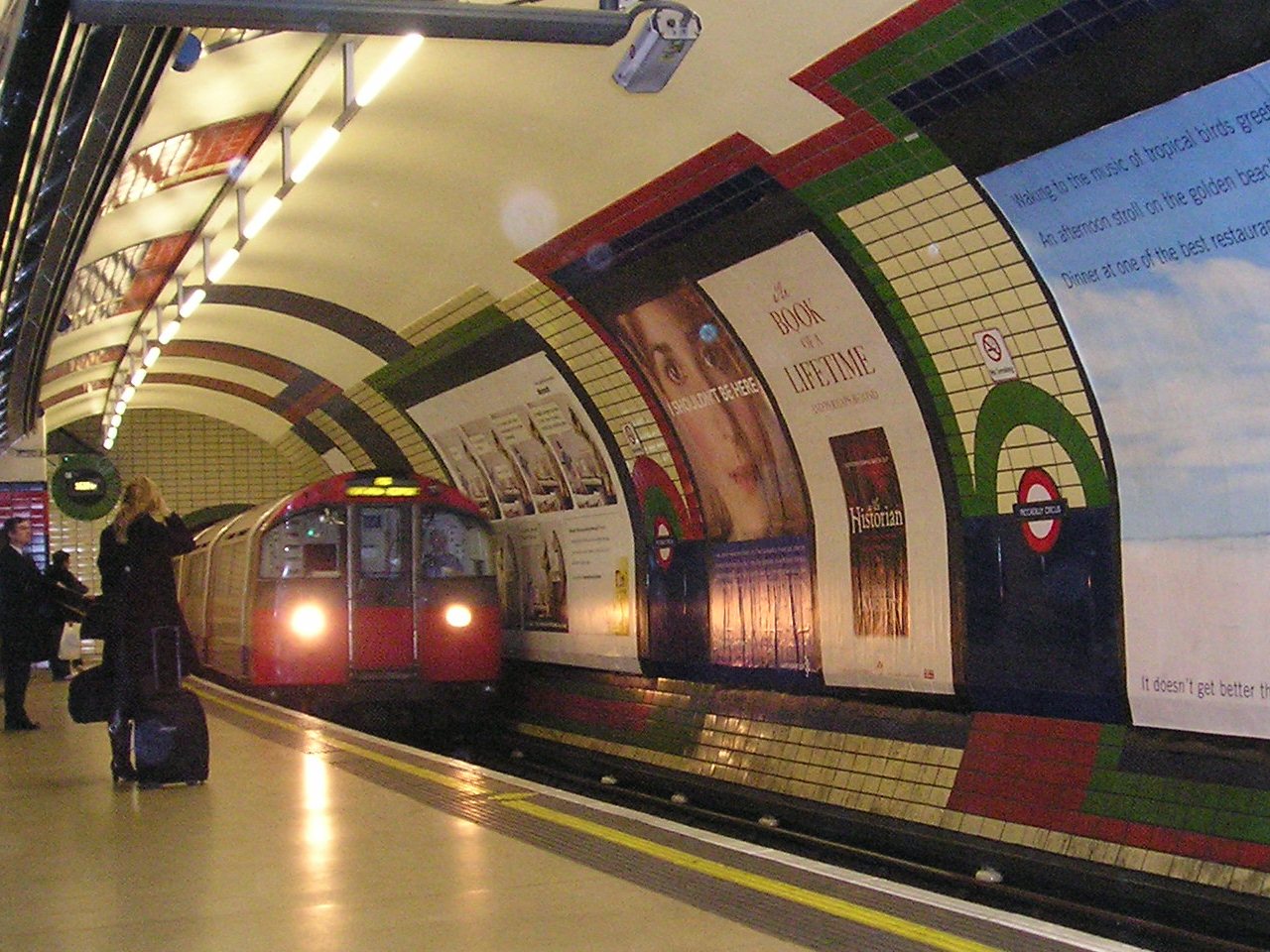
or a tube station.


However we found that the tube station location that we looked into using was going to cost 300 pounds and we did not have this in our budget. So we decided that we need to find a location with little or no cost. We came to the conclusion to look into using a location that was possibly on campus and would therefore have no cost.

Friday 7 October 2011

Casting Our Music Video.

As our narrative depends on the portyal of emotions and feelings we decided to look at a list of drama studants who would fit the role required for our video. And highlighted their names on a list. We then went on to look at photos of them from the schools list of studants and refined the list as to who would fit the role


How We Incorporated a Performance Element.

We looked at a series of different videos of a similar genre and several live Radiohead performances and looked at the way in which they as a band perform live and how other similar band types shoot their performance elements.

Once video that really caught our attention was Neutron Star by Muze and we really liked the idea of backlighting our artists in order to sitluette them rather than have them clearly or brightly lit. This went along with our narrative idea that not everything is clear and that you never really see the full picture.


 We then looked at a live radiohead performance of climbing up the walls and found that they perfomed it in a very similar way via alot of smoke and larde lights at the back of the stage.

Thursday 6 October 2011